Curiosity beyond the interview brief
During my interview process for a UX Design Internship at Safaricom, candidates were given a design challenge:
"Design a parking booking experience for employees returning to the office, allowing them to check availability, reserve, and cancel parking slots across company offices."
The exercise ended there. For me, it didn't.
After receiving the internship offer, I became curious about how employees were actually booking parking at Safaricom. I sought out the existing Parking Request App to understand how the real-world experience compared to the challenge I had just completed.
What started as curiosity quickly became an opportunity.
Returning to the office, rising demand
As employees returned to the office through hybrid and full-time work arrangements, demand for parking increased. The existing parking request experience supported the core task of booking a parking slot, but the process felt fragmented and difficult to navigate.
I wanted to understand:
- How employees currently booked parking
- Where friction existed in the journey
- Whether the experience could better support employees' day-to-day needs
Understanding how employees book parking
Before redesigning the experience, I wanted to understand how employees currently requested parking, where friction existed, and how the process was managed internally.
To build a complete picture, I combined three research methods:
I used the app to book parking to understand the general architecture, functionality and navigation. I also requested booking for a colleague to understand that journey as well.
I conducted interviews with 5 employees to uncover usability issues and pain points. Apart from interviews, I observed employees requesting a booking and actively listened to their sentiments and reactions when using the app.
I had a discussion with the team that developed and manages the application to understand the capabilities and limitations of the platform (PowerApps) that the app is built on.
Pain points from app analysis and user interviews
From the app analysis and user interviews, I gathered the following insights:
With the current journey, employees have to input their number plate every time they make a request.
Fields such as job group and vehicle type have only one choice, accessed via a dropdown — adding friction without value.
When booking a spot, if there aren’t available spots in the chosen block, users have to go back and forth between two screens to choose a different block and check if there are available spots.
Booking requests expire at 9:00am, and if an employee hasn’t accessed it, it is made available for booking by other users.
The interface felt dated and did not match employees’ expectations for a modern workplace tool.
Who we were designing for
Two recurring employee profiles emerged from the interviews, each with distinct needs and frustrations:

He is assigned different company cars in a week to carry out his roles. Works from office at least 2 days a week.
Find and book a parking space at the beginning of the week for days he will be in the office. Also find parking when called for an emergency meeting at the office (on demand).
- Booking is by request for a day and not on demand
- Requests expire at 9am and if he's not parked, the spot can be assigned to another employee
- Having to move back and forth between two pages to find an available spot between different blocks

Owns a car and prefers driving to work. Works from office at least 3 days a week.
Find and book a parking space one day before the day she goes to the office. Also find parking when called for an emergency meeting at the office.
- Having to input some constant information repetitively
- Lacking parking space on some company blocks and being forced to use a cab or public transport instead
Why the experience worked the way it did
From the stakeholder discussion, I learned that every friction point had a reason rooted in platform constraints:
The repetitive nature of the current journey is because there are users, especially engineers, who use different cars (pool cars) at different times of the week to come to the office. This scenario prompted the application to be designed to require users to fill the car number plate every time to accommodate the changing car number plates.
The app is not a native app and doesn't record user sessions to allow for auto-filling of repetitive information like car number plate.
Booking is done by day and not by demand because the team that developed the app envisioned employees being stuck in the office past the time they had booked, which could be chaotic.
The app doesn't sync in real time or hold/block a session for one user once they start booking.
The requests expire at 9:00am because there currently isn't a way for the app to detect when a car is actually parked.
Understanding these constraints shaped what was feasible to redesign within the existing platform.
Four parking journeys hidden behind one form
Beyond the surface-level pain points, research revealed multiple parking scenarios hidden behind a seemingly simple booking process:
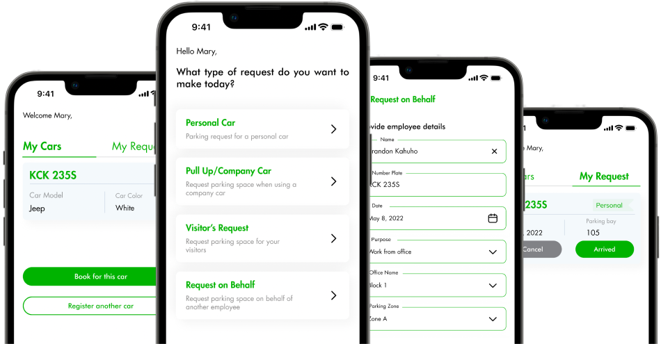
Employees requesting parking for their own vehicles.
Shared company vehicles requiring different approval workflows.
Parking requests initiated on behalf of guests.
Administrative requests made for other employees.
Each journey carried different information requirements, rules, and approvals.
The question became: how do we support these scenarios without making the experience feel complicated?
Structured around intent, not system requirements
I restructured the information architecture around employee intent rather than system requirements. Instead of presenting users with a generic request flow, the experience guided them toward the appropriate journey from the start.
Key Design Decisions
- Simplified navigation and request creation
- Grouped parking requests by user intent
- Reduced cognitive load through progressive disclosure
- Improved visibility of request status and approvals
- Created guided flows for different parking scenarios
The goal wasn't to add functionality. It was to make the existing functionality easier to understand and use.
From a parking redesign to a platform vision
The redesigned parking experience demonstrated how a focused, research-driven approach could improve employee services.
What began as a redesign of a parking request tool ultimately revealed a much larger opportunity: employees were interacting with multiple disconnected workplace services. Parking was only one of them.
The learnings from this work contributed to the creation of a broader vision — an Employee Super App that unified employee services into a single experience.
The platform expanded beyond parking to include:
- Payslips
- Airtime top-ups
- Workplace services
- Employee utilities
Recognized under Safaricom's CEO Awards
The most valuable outcome wasn't the redesigned parking flow. It was uncovering an opportunity to rethink how employees accessed workplace services altogether.
The resulting Employee Super App was recognized under Safaricom's CEO Awards in the Business Growth category, highlighting the value of creating a more connected employee experience.
Curiosity is often the starting point of innovation
This project reinforced a lesson I carry into every engagement: the redesign wasn't part of my internship responsibilities. It began with a simple question:
"What does the real experience look like?"
That question led to research, insights, a redesigned product, and ultimately the foundation for a platform that transformed how employees access workplace services.
Curious about the research or the design decisions behind this work?
Get in touch