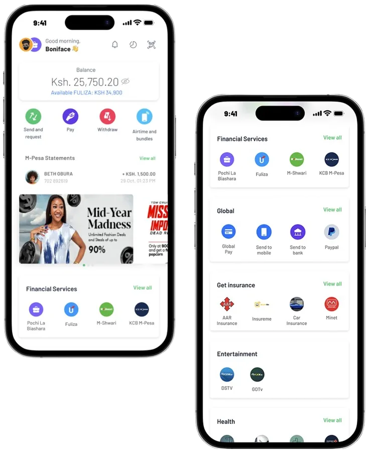
Launching the M-PESA Super App
In 2021, M-PESA Super App was launched with a feature:
- Mini apps — enable customers and businesses to complete day-to-day and occasional tasks within the M-PESA Super App.
A super app typically integrates various services and features within a single platform, offering users a seamless and comprehensive experience.
Customers could access the Mini-Apps through the "Discover" option on the App. The first services available include Madaraka, BuuPass, Mtickets, GiftPesa Vouchers, eBima, and Pro-Gas.
Low adoption of Mini Apps
The adoption of the mini apps was significantly below the expected levels. Despite initial expectations and efforts, the services failed to gain sufficient traction.
The lack of adoption posed a challenge and justified the need for a redesign to address the underlying issues and improve the mini apps' performance.
Listening before redesigning
To uncover the problem and user need, I contributed to a research effort to understand how customers were actually using the M-PESA homepage. The work combined user interviews and in-app usability testing.
We conducted a usability study to understand why the mini apps aren’t gaining traction. The goal of the study was to test consumers interaction with new components on the home page and services tab.
We were looking to discover:
- How consumers discover and reach mini apps?
- How often do they use mini apps and which mini apps?
- Consumers' search and filtering behaviour
- How users access statement?
- Which other services would consumers want to see?
User tasks
- You ran out of mobile data, use M-Pesa app to buy bundles to keep using mobile data on your device
- You need to go to Mombasa, use M-Pesa app to buy a ticket using any transportation to get there
- You have to check for a payment you made 2 months ago, use the M-Pesa app to confirm that payment
- You are about to run out of cooking gas, use Rubis on the M-Pesa app to buy a K-Gas 6kg refill
- You would like to go to Nairobi National Museum, use Little Cab on M-Pesa app to get a ride
- You need to make an international payment, a friend told you could do that using GlobalPay and copy card number
Success Metrics
Signals we tracked to measure task success.
What we learned from users
We could see users believe, trust and are satisfied with the app.
Users trust and are satisfied with the app.
1. Good app experience perception
- Good usability and discoverability of core services
- Easy to use and friendly
- Hakikisha feature allows confirmation of recipient before sending money
2. Security and convenience
- Hakikisha feature reduces erroneous transactions
Where the experience falls short.
- Lack of discoverability — most users tried to find all the mini apps on the home screen
- Lack of knowledge — most participants didn't know about external services
- Point of entry — most participants used the home screen category, then the services tab, and fewest used the services tab category
- Most users don't use search to find services, and when they do, they expect a more efficient search
Define the problem and hypothesis
With research in hand, we framed the problem, set a hypothesis, defined how we'd measure success, and committed to a guiding user story for the redesign.
From the recently concluded usability study one of the main findings is that generally the bottom navigation bar is not used. Therefore, users interact a lot with the home screen but do not explore the other areas on the bottom bar to access the tabs below:
- 1Transact tab — all M-PESA products and services on the app
- 2Services — mini app entry point for all external mini apps
- 3Grow — tab focused on next financial services such as credit, wealth management and insurance
Because of this customers then do not interact with and use key features and products on the M-PESA app. Therefore, we want to redesign the app primarily to increase the discoverability and use of the features.
Future Hypothesis
Currently customers mainly interact with the core M-PESA transactions.
Although these products drive the most usage in terms of volumes, values and revenue, we also want to highlight other areas that are key to the growth and continuity of business.
The aim of the redesign is to increase the discoverability and use of financial services, external services, GSM services and global services.
Measure of Success
As a result, increased active users for financial services, external services, GSM services and global services.
"As a consumer, I want the homepage to show me lifestyle services so that I can easily find and explore them for the business to improve discoverability of key growth areas."
Exploring layouts through low-fidelity concepts
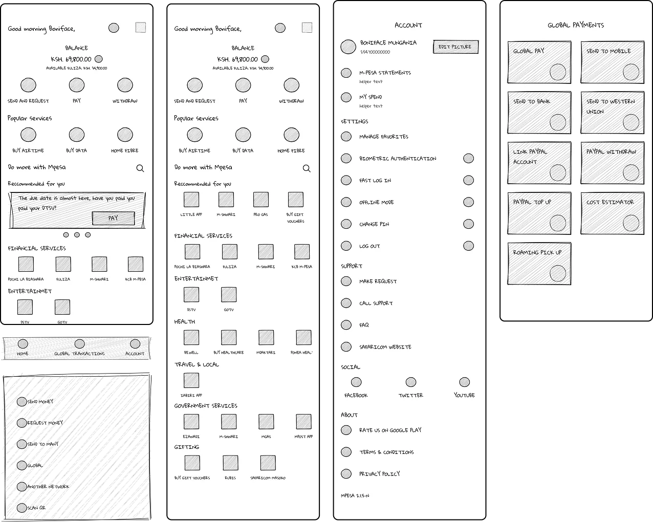
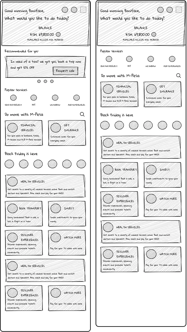
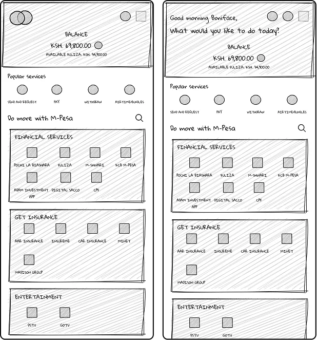
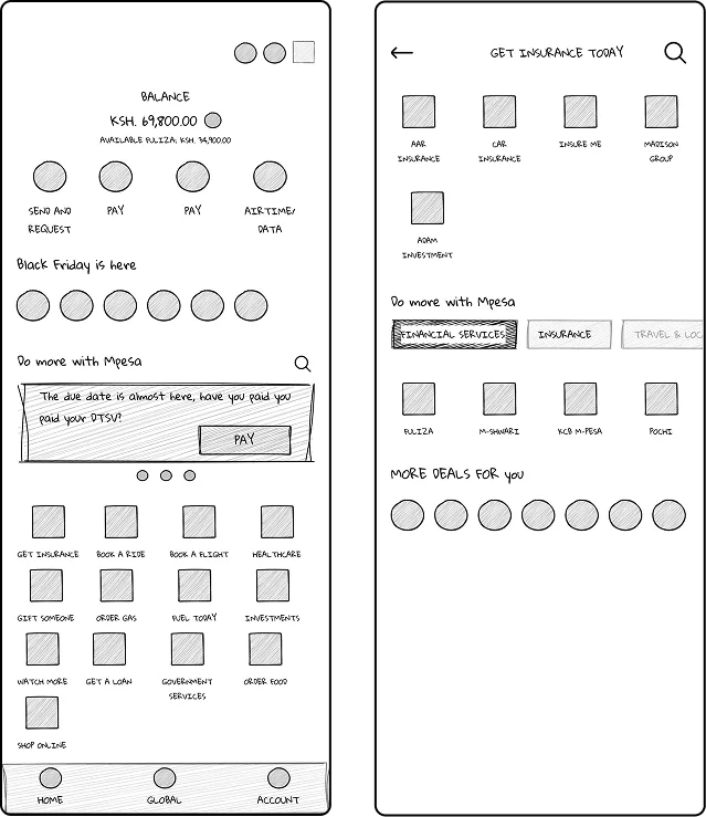
The redesign process started with creating low-fidelity visual representations of the user interface that outlined the layout, structure, and functionality of the redesigned UX.
- Similarity
- Buckets that group mini apps into service categories.
- All four concepts introduce service buckets to make discovery clearer — financial services, entertainment, health, travel, and more grouped intentionally.
- Difference
- Layout and structural hierarchy.
- Concepts vary in how the balance, popular services, recommendations, and buckets are sequenced and weighted on the homepage.
- New pattern
- Stories for deals — a social media mental model.
- We introduced stories as an exciting, familiar way to view and access deals across different services.
- Reorganization
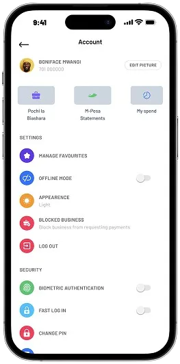
- Statements and My Spend moved to the Account page.
- Personal financial overviews now live where users manage their profile, freeing the homepage for discovery.
Consolidating concepts into a polished direction
The concepts were presented to relevant stakeholders, who were impressed with different features across the explorations. The next step was consolidating them by identifying the most favourable elements and combinations that aligned with the project objectives. This resulted in two refined home page directions, supported by a consistent set of secondary screens.
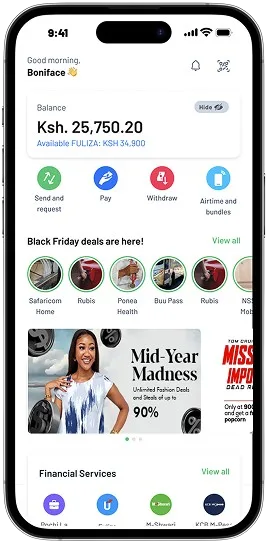
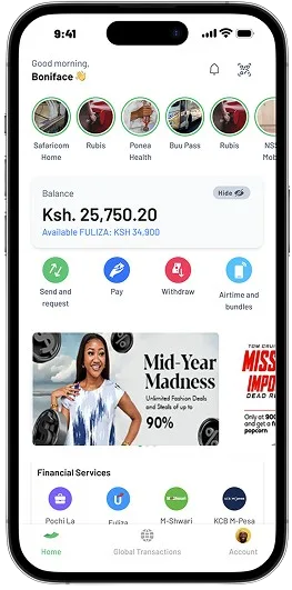
Companion flows that complete the redesign: viewing a story, the dedicated global transactions tab, and a reorganized account page that hosts statements and my spend.

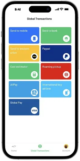
Validating the redesigned journey
We conducted usability tests to evaluate the usability and friendliness of the new journey. We also ran an A/B test to compare and evaluate which of the two homepage designs performed better in terms of user engagement, conversions and feature discoverability.
What worked well.
- Increased mini app discoverability
- Recognition of different services categories
Where the experience still fell short.
- Consumers didn't understand the concept of stories
- Consumers wanted to know why we removed transactions from the home page
Simplify, prioritize, make actions obvious
Translated the research insights into a UX strategy that re-centered the homepage around the user's most frequent and most valuable actions. The redesign simplified the layout, established a clear information hierarchy, and surfaced mini apps with intention rather than density. Some of the main features of the new design include:
- Personalization — added a salutation to create a more customized and individualized interaction, making users feel acknowledged and valued.
- Core business of M-Pesa anchored at the top
- Use of lowercase to increase readability and deliver a more approachable and conversational tone.
- M-Pesa statements to enhance financial transparency and help consumers keep track of their financial activities.
- Value buckets to group related services to increase visibility and reachability.
- Announcements — more appealing images and personalized copy to intrigue and catch users' attention.
The new homepage had +46% surge in interactions servicing over 21+ million customers.
Want to talk through the research or the design decisions?
Get in touch